ロゴへの想い
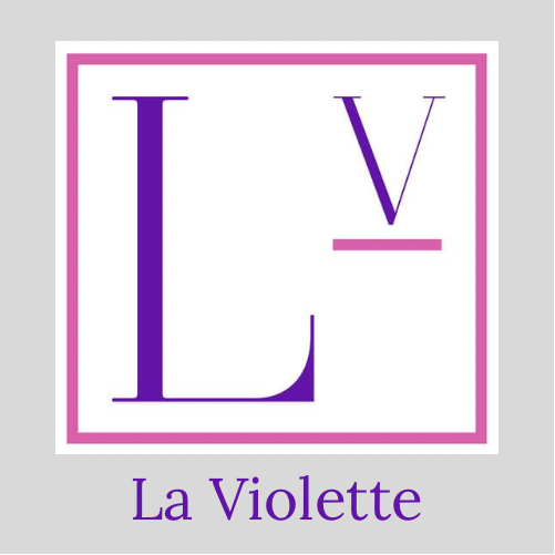
店名に表現したすみれバイオレットと、フラワーピンクの2色をテーマカラーに選びました。
宝塚駅と宝塚歌劇場を結ぶ花のみちには、四季折々美しい花が咲き、通りゆく人々を楽しませてくれます。
華やかで上品な宝塚の街、そこを行き交う可憐でお洒落な人々をイメージしてデザインしました。
このロゴには、実はLOVEというアルファベットが秘められております。
見つけられたお客様と、今心が通じておりましたら幸いです! L ⬜︎ V E 。
VアンダーバーはLa Violetteが始動するスタートラインを意味します。
La Violetteは、宝塚を始めとして今後1人でも多くの方に印象に残るスイーツを提供したいと考えております。
La Violetteを訪れる全てのお客様に、愛が届きますように。
Thoughts on the logo
I chose two theme colors, Sumire Violet expressed in the name of the store and Flower Pink.
On the flower path connecting Takarazuka Station and Takarazuka Opera, beautiful flowers bloom every season and entertain those passing by.
I designed it with the image of the gorgeous and elegant city of Takarazuka, pretty and fashionable people coming and going.
In fact, there is an alphabet “LOVE” in this logo.
We are happy if you see L ⬜︎ V E here.
The V underbar expresses the start line in which La Violette starts.
La Violette would like to provide sweets that will leave an impression to as many people as possible in the future.
May love reach all visitors to La Violette.